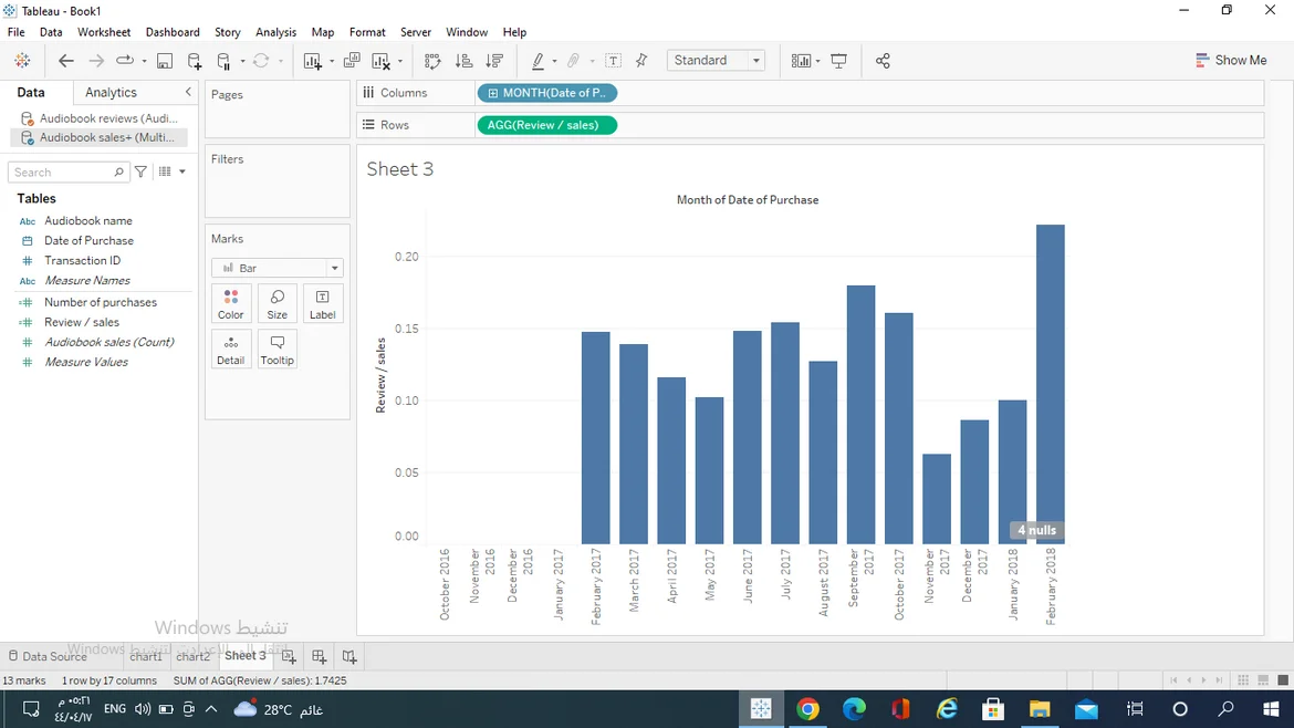
My graph is different why?
I blind the data in date for both data sources (year and month)
but I got different bar chart
Feb 2018 has the highest ratio
6 answers ( 0 marked as helpful)
I got this graph as well. Can someone assist please? I'm trying to edit the horizontal axis title but I am unable to do so
Go to month and make it continuous
Same is happening with mine.
I have the same problem
same issue
i tried recreating and the chart keeps changing no idea why, but never looks like the same underlying data as on the intsructional video. Im lost...
i tried recreating and the chart keeps changing no idea why, but never looks like the same underlying data as on the intsructional video. Im lost...
SOLUTION: I found out why if anyone i still interested. Bc the dataset is slightly different. When i used the dataset that we originally worked with, i had the same bar chart as yours. but then i downloaded the specific dataset provided for this activity, re-did the activity as a practice and voila... the bar chart resembles his. so the datasets to be used to produce the same graph are: 3_15_audiobook-sales.xlsx and 3_15_audiobook-reviews.xlsx
Submit an answer