Technical Analysis Basics in Financial Markets: Applications and Core Assumptions
Master technical analysis basics by exploring key chart types, trading volume, and relative strength indicators. This guide shows how these tools support smarter trading decisions in today’s financial markets.
Join over 2 million professionals who advanced their finance careers with 365. Learn from instructors who have worked at Morgan Stanley, HSBC, PwC, and Coca-Cola and master accounting, financial analysis, investment banking, financial modeling, and more.
Start for Free
Technical analysis is a widely used method of evaluating financial securities by analyzing historical price movements and trading volume. Rather than focusing on a company’s fundamentals, it relies on patterns and trends in market data to guide investment decisions. To better understand its practical applications, it’s essential first to explore the technical analysis basics and the core principles that underpin this approach.
Technical Analysis Concepts and Assumptions
At the heart of technical analysis lie three fundamental ideas:
- The price of a security is determined by supply and demand.
- Changes in supply and demand lead to price fluctuations.
- Future price movements can be projected using charts and technical tools.
To understand why this method is so widely used, it’s essential to examine its assumptions. The central tenet of technical analysis is that a security’s valuation reflects the collective actions of rational and irrational market participants. Emotions, instincts, and crowd behavior—often called “animal spirits“—can significantly influence investor decisions.
These psychological factors can create price movements that defy traditional valuation models, making them crucial to understanding market trends.
Two common metaphors symbolize this dynamic:
- The bull—representing optimism and rising markets
- The bear—depicting pessimism and declining markets
When investor sentiment turns bullish, prices tend to increase; when it turns bearish, prices often fall. Because these psychological forces can disrupt the notion of an “efficient” market, technical analysis assumes that prices are not always a perfect reflection of intrinsic value. To understand technical analysis basics, it’s essential to recognize that prices are shaped by recurring behavioral patterns that technicians aim to identify and interpret.
Technical analysts believe that past market behavior leaves behind identifiable signals in price and volume charts. By studying these historical trends, they attempt to forecast future price movements. This involves recognizing repetitive patterns and leveraging them to anticipate where the market might head next.
Applications in Financial Markets
Technical analysis is especially useful for assets like commodities, currencies, and futures—markets where traditional fundamental analysis is limited due to the lack of income-generating components, such as dividends or interest. Because technical analysis relies on price and volume data, it’s most effective when applied to assets traded on public exchanges with sufficient liquidity. Thinly traded or illiquid assets may produce unreliable signals, reducing the method’s effectiveness.
This dependence on active markets underscores the importance of liquidity in generating meaningful technical insights.
The growing accessibility of real-time market data and increased market liquidity have contributed to the rising popularity of technical analysis. While some traders use it exclusively, others integrate it with fundamental analysis to form a more comprehensive strategy. Regardless of the approach, technical analysis is often employed to identify optimal entry and exit points for trades.
Constructing and Interpreting Technical Analysis Charts
Performing technical analysis without charts is like playing basketball without a basketball—it simply doesn’t work. Charts are the cornerstone of this analytical approach, serving as visual tools to identify patterns, trends, and price behaviors. Understanding the most widely used chart types and how each is interpreted is essential for technical analysis basics.
Line Chart: Simplicity and Trend Observation
The line chart remains one of the simplest and most widely used tools in technical analysis. It displays a security’s closing prices over time by connecting each data point with a continuous line, offering a clear view of overall trends.
For instance, a five-year line chart of the S&P 500 from 2019 to 2024 highlights a sharp drop in early 2020 due to the COVID-19 pandemic, followed by a strong recovery driven by stimulus measures and economic reopening. In 2022, market volatility returned during inflation concerns and tightening monetary policy, but the index showed signs of resilience into late 2023 and early 2024.
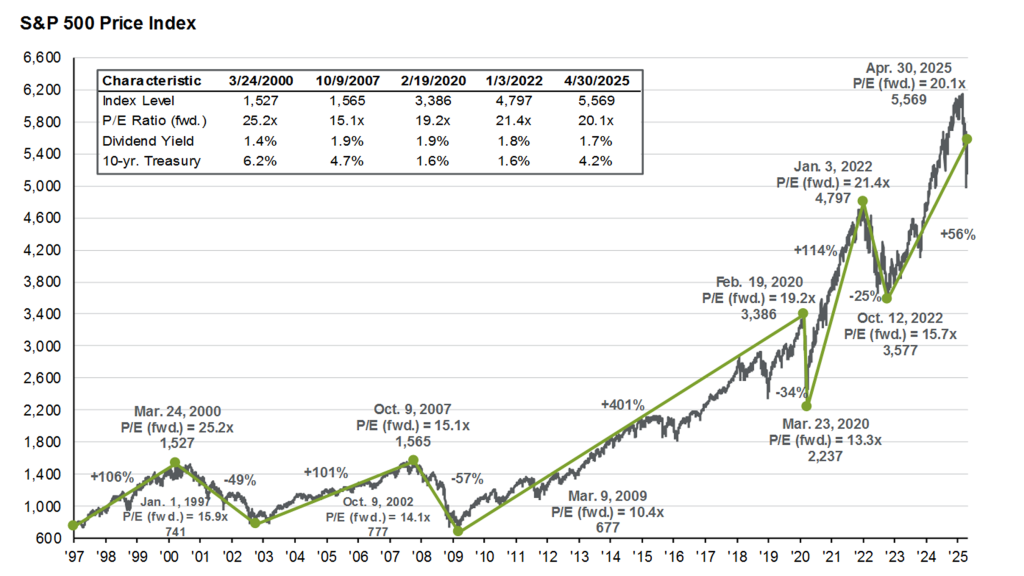
Line charts are ideal for identifying general price trends over time and are easily accessible.
Bar Chart: Capturing Daily Price Dynamics
A bar chart provides more detail than a line chart. Each vertical bar on the chart represents a single trading period and includes:
- The highest and lowest prices of the day
- The opening price (small horizontal tick on the left)
- The closing price (tick on the right)
- The range of price movement (volatility)
The length of the vertical bar indicates price volatility—longer bars suggest greater price swings, while shorter bars reflect stability. A chart allows analysts to examine how prices behave within individual trading sessions.
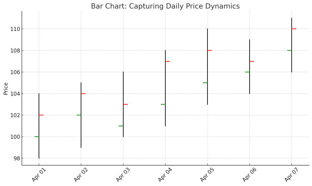
This sample bar chart illustrates daily price dynamics using the OHLC (Open, High, Low, Close) format. Each bar shows the trading range (high to low), with ticks for the opening (left) and closing (right) prices—perfect for analyzing daily volatility and session behavior.
Candlestick Chart: A Visually Intuitive Alternative
The candlestick chart—developed centuries ago in Japan—offers the same price information as a bar chart but in a format that’s easier to interpret visually. As part of technical analysis basics, this chart type is widely used because each “candle” represents a single trading period and consists of the following:
- The Body indicates the opening and closing prices.
- The Wick (or Shadow) shows the high and low of the day.
- Color/Shading: An unshaded (or green) candle means the closing price was higher than the opening price (bullish), while a shaded (or red) candle means the closing price was lower (bearish).
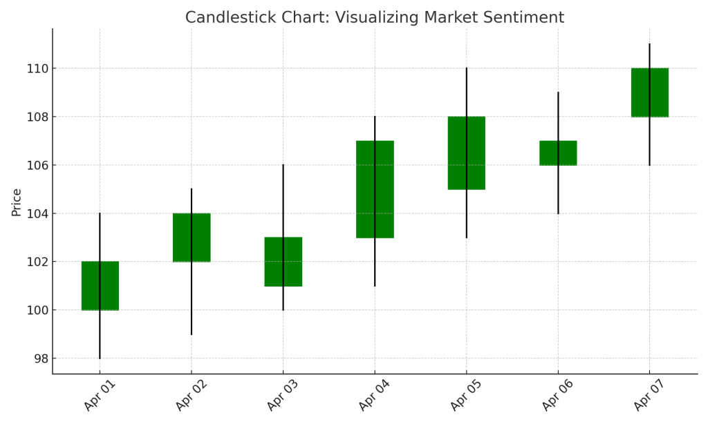
Candlestick charts are useful for identifying price direction, momentum, and reversal signals at a glance, especially when analyzing consecutive trading days.
Point and Figure Chart: Filtering Out the Noise
Point and figure (P&F) charts offer a unique approach by focusing solely on price movement, ignoring time and volume. Developed in the early 1900s, this method was designed without modern charting tools. Here’s how it works:
- Structure: X’s represent price increases, while O’s indicate declines. These are plotted in columns on graph paper.
- Box Size: Defines the minimum price movement needed to add a new X or O (e.g., $1 per box)
- Reversal Size: Determines when to shift from X’s to O’s or vice versa (typically three boxes)
For instance, with a $1 box size and a 3-box reversal, a $1 price increase adds one X; a $3 decline triggers a new column of O’s. This format filters out insignificant fluctuations and highlights meaningful trends and breakout points.
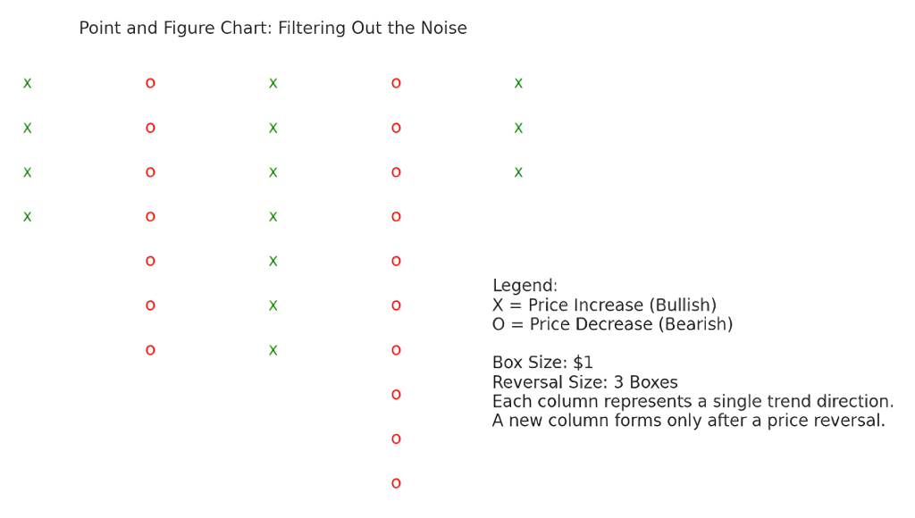
P&F charts are powerful for identifying support/resistance levels and trend reversals, making them particularly useful for long-term analysis.
Choosing the Right Chart
Each chart type offers unique insights:
- Line charts for broad trends
- Bar charts for detailed session data
- Candlesticks for intuitive pattern recognition
- Point and figure charts for clean trend signals and breakout detection
These foundational tools help analysts visualize market behavior and prepare informed strategies.
Additional Tools Used in Technical Analysis
Let’s now consider key technical indicators that enhance these charts—adding another layer of depth to market analysis. In learning technical analysis basics, it’s essential to recognize that beyond charts, technical analysts rely on several complementary tools to forecast price movements and assess market sentiment. These tools help refine interpretations and improve the accuracy of trading signals. Two commonly used methods are trading volume analysis and relative strength analysis.
Trading Volume: Gauging Market Participation
Trading volume refers to the number of shares or contracts exchanged during a specific period. It often appears just below price charts—platforms like Yahoo Finance include this by default.
Volume data is a key indicator of market conviction. When a high trading volume accompanies a price increase, it’s typically seen as a strong, credible signal—more participants are willing to buy at higher prices, confirming the upward trend. Conversely, if volume declines while the price rises, it may suggest weakening demand—fewer buyers support the move, potentially signaling a reversal.
Low volume during a rally can be a red flag, indicating that a price surge may lack sustainability. As a result, technical analysts often view changes in volume as early signs of strengthening or weakening momentum.
Relative Strength Analysis: Comparing Performance to a Benchmark
Relative strength analysis involves comparing a security’s performance to that of another asset, its industry peers, or a broader market index—such as the S&P 500 or NASDAQ.
This comparison helps analysts determine whether a stock is outperforming, underperforming, or moving in line with the benchmark. For example, suppose a particular stock consistently rises while the broader market remains flat or declines. In that case, the stock is gaining relative strength and could be undervalued or gaining attention for strong fundamentals or sentiment.
Such signals can prompt further investigation into the stock’s underlying drivers, offering a potential edge in decision-making.
The technique is often used to identify candidates for buying or selling based on how their performance compares to the broader market—especially during market cycles when certain sectors outperform others.
When used alongside price charts, these tools enhance the depth of analysis. Volume reveals conviction behind movements, while relative strength reveals positioning within a broader context. Combined, they help technical analysts make more informed decisions.
Understanding Technical Analysis Basics
Grasping technical analysis basics equips traders with essential tools to interpret price movements and market trends. By leveraging charts and indicators like volume and relative strength, this method helps identify potential entry and exit points—making it a valuable approach in today’s fast-moving financial markets.
To deepen your understanding and confidently apply these concepts, consider joining the 365 Financial Analyst platform for structured learning and hands-on practice.