How to Insert an Excel Chart
Join over 2 million professionals who advanced their finance careers with 365. Learn from instructors who have worked at Morgan Stanley, HSBC, PwC, and Coca-Cola and master accounting, financial analysis, investment banking, financial modeling, and more.
Start for Free

You have never created an Excel chart before?
And you want to know how to start?
Then this is the perfect tutorial for you. In this article, I will show you how to insert charts in Excel.

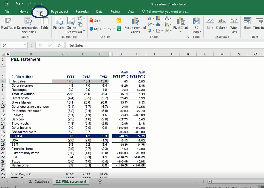
Here’s a sheet with some data in it.
Let’s say that I would like to create several charts to visualize the data in a better way. How can I do that?
First of all, I’ll select the data that I’d like to include in a chart and will click on the Insert tab.
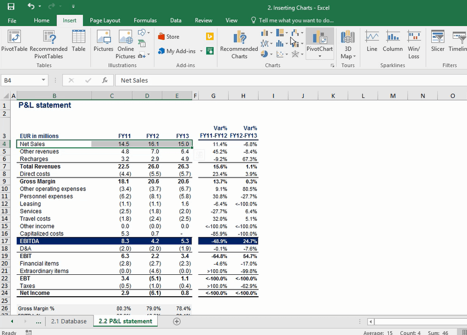
Here you can see the “Charts” section, where we have a number of chart buttons.
Microsoft Excel 2016 is really great because it includes the “Recommend Charts” functionality, which will suggest us several types of charts that are likely to represent well the data that we have selected.
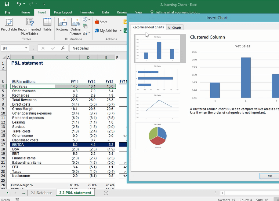
Clicking on “Recommended charts”, we’ll be shown a set of charts that will best fit to our data according to Excel.
And here we are. We have a column chart, a bar chart, a line chart, and a pie chart. Pretty much the four basic, traditional types of charts that we can have.
I’ll select the line chart and will click “Ok”.
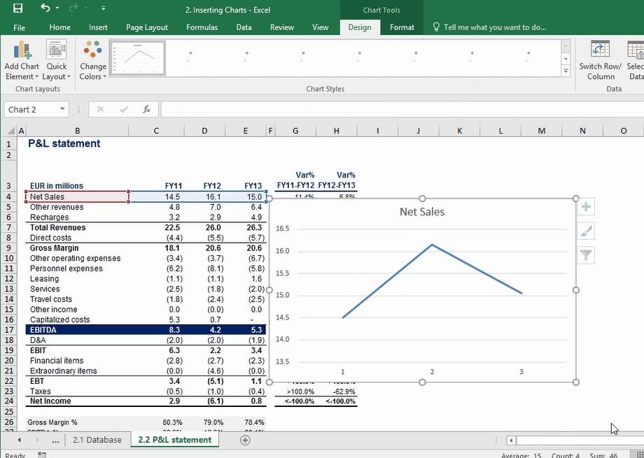
Our chart is ready.
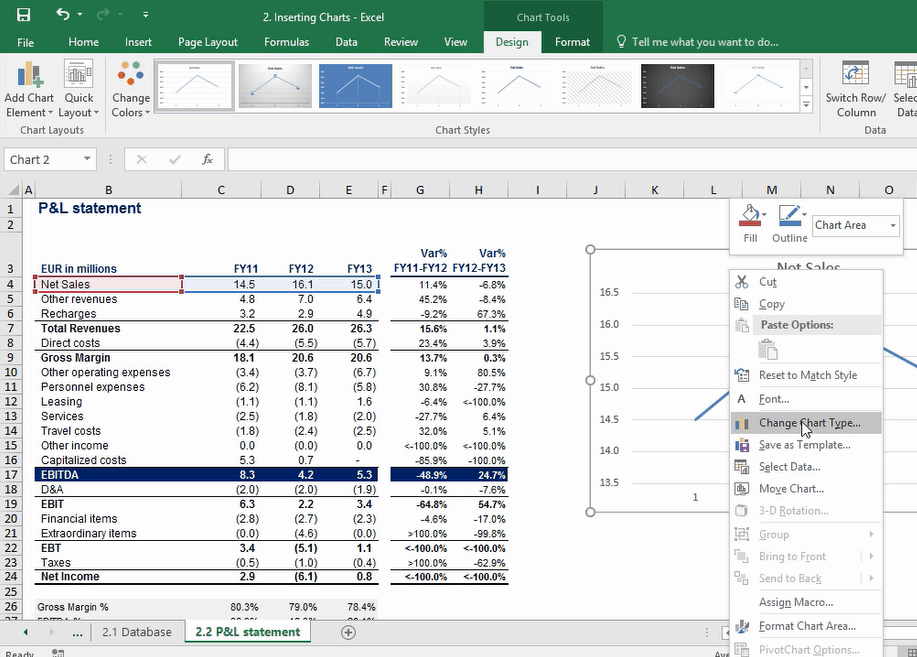
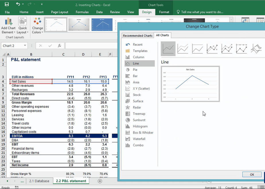
If we change our mind and decide that we would like a different chart, we can always click the “Change Chart Type” button and select the type of chart that we would like. There are a lot of options.
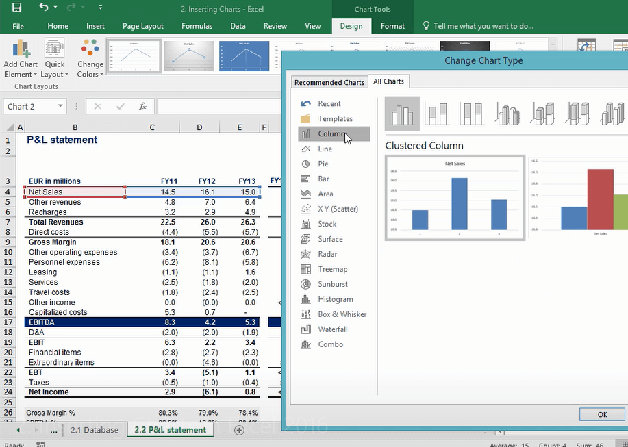
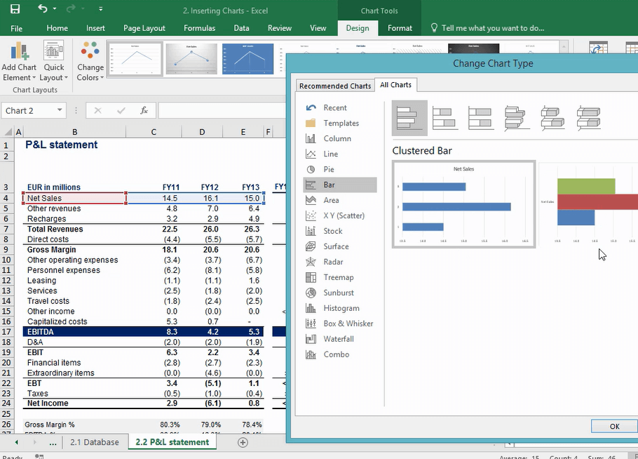
The right side of the window provides us with a small preview of the chart that we are about to select.
This is how a column chart would look like.
And this is how a bar chart would look like.
There are a lot of options that we can select from. The important thing is that you pick the one that best describes the data that you are working with.
This is how we insert charts in Excel. In our next post, we’ll learn how to modify an existing chart in Excel.
Thanks for sticking until the rest of the article!