How to Edit an Excel Chart
Join over 2 million professionals who advanced their finance careers with 365. Learn from instructors who have worked at Morgan Stanley, HSBC, PwC, and Coca-Cola and master accounting, financial analysis, investment banking, financial modeling, and more.
Start for Free

So, you have inserted a chart in your document?
But now you would like to format the graph professionally?
Great! In this article, we’ll teach you how to do that step-by-step.
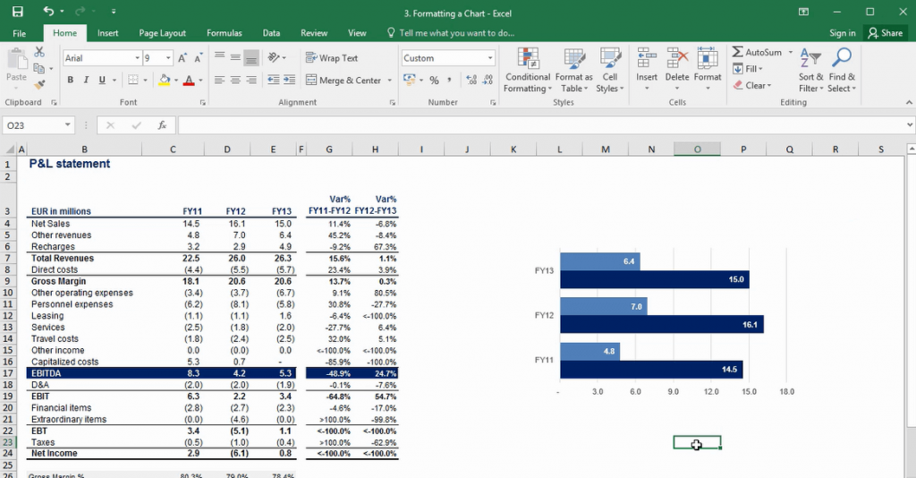
Let’s suppose that this is the chart you have added.
Throughout the years Microsoft have made some great improvements in the way Excel charts look and feel when initially inserted. However, this doesn’t mean that you shouldn’t be able to format your charts and that there’s no room for improvement from the default settings.
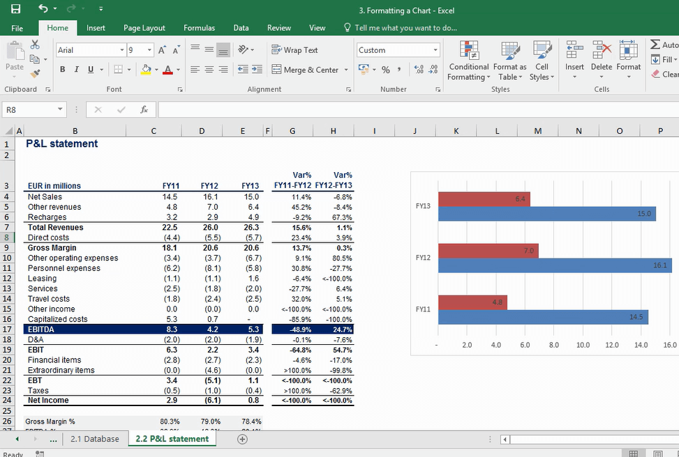
All right. Let’s see how we can format this graph professionally.
Pro tip: Don’t feel like reading a text tutorial? Try our free AI study buddy now—it can show you where to click.
I prefer to have my charts in Arial – that is why I’ll right-click over the chart and select its font to be Arial.
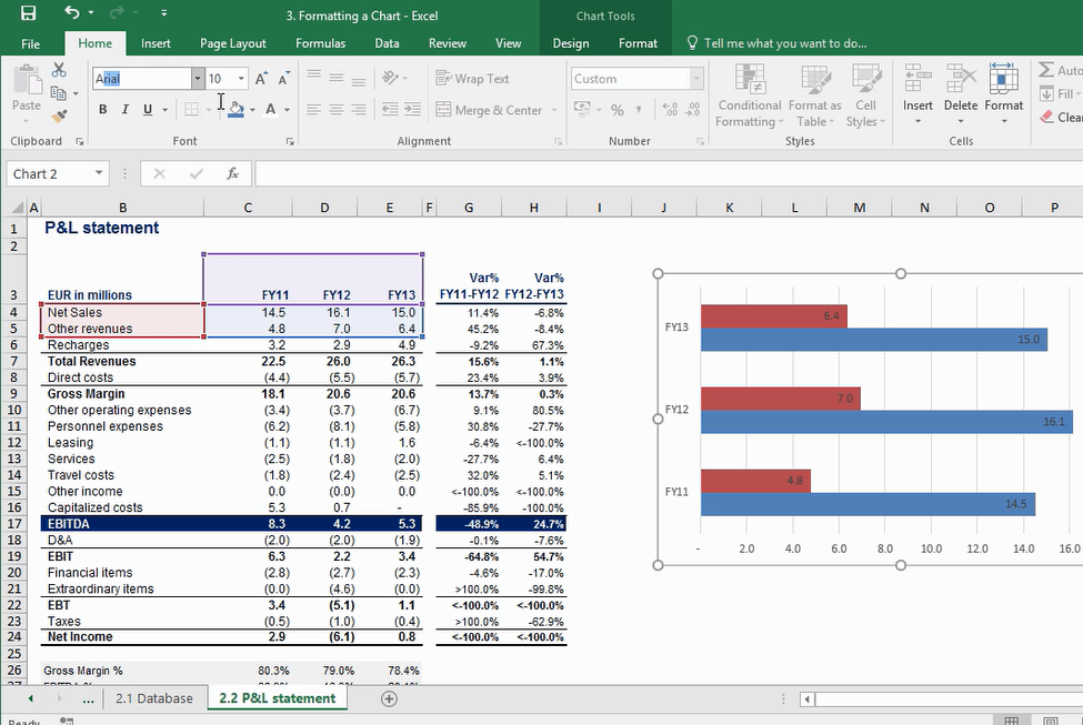
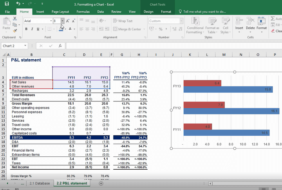
My favourite font size is 8. Don’t worry, it isn’t too small.
Let’s do another right-click, but this time select “Format Chart Area.”
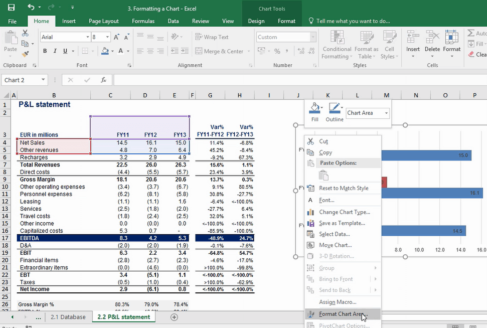
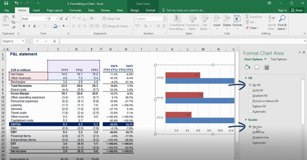
Here, I’d like to remove the fill of the chart and its border-line. Click “No” for both.
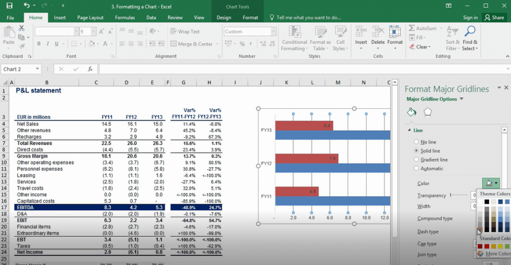
The next step will be to render the gridlines less invasive. Let’s select the gridlines and do a right-mouse click in order to select “Format Gridlines.” I’ll choose to have a solid line, which is gray and is transparent at 75 percent. I think gridlines look much better this way.
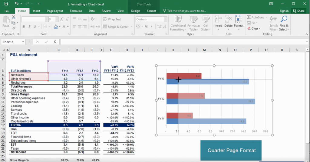
Let’s adjust the size of the chart, as we want to have a quarter-page chart.
We’ll need to select a label for the horizontal axis. I’ll just click on the chart, choose “Select Data,” go to the “Horizontal Axis Title” section within the dialog box which opens and select the three years under analysis, as we have the breakdown of revenues for each of these years in the three columns. Let’s change the colors of the chart a little bit. Usually, I prefer changing the default colors of Excel charts.
“Net Sales” will be in dark blue.
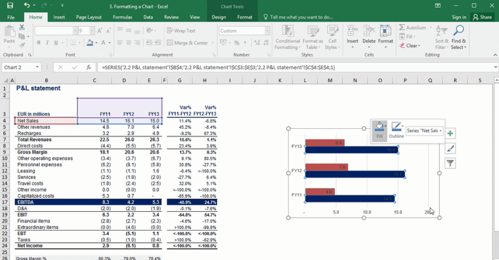
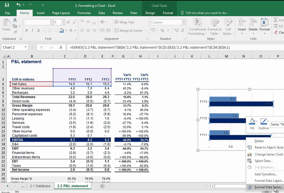
Now, let’s make the columns of our chart a bit larger. In order to do this I’ll make a right-click on one of the columns and select “Format Data Series.”
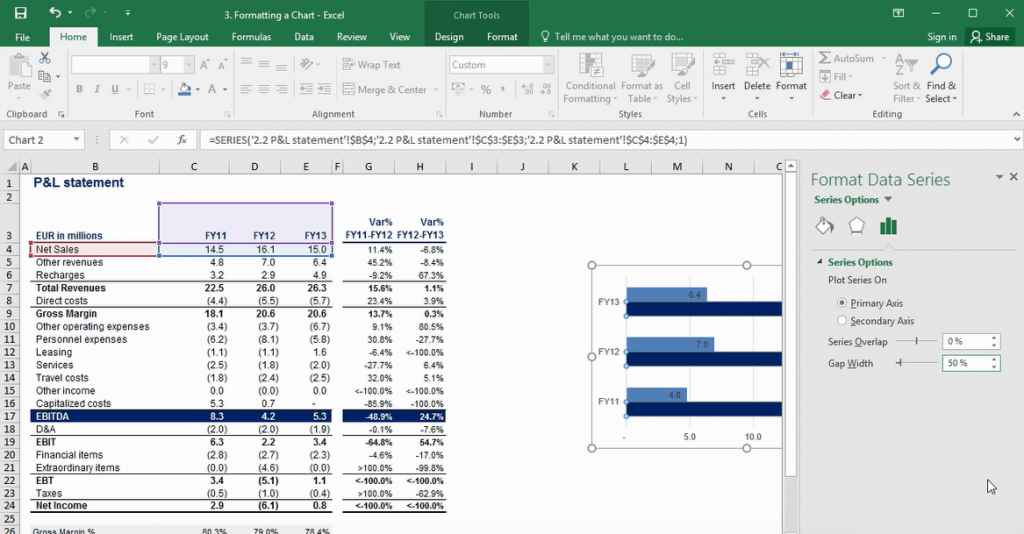
Once I am in the “Format Data Series” menu, I’ll reduce the size of the “Gap Width” from 150 percent to 50 percent. OK.
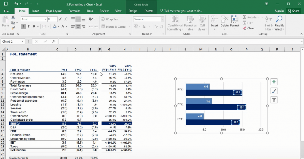
The default labels are in black, but probably the better option is to have them in white and in bold.
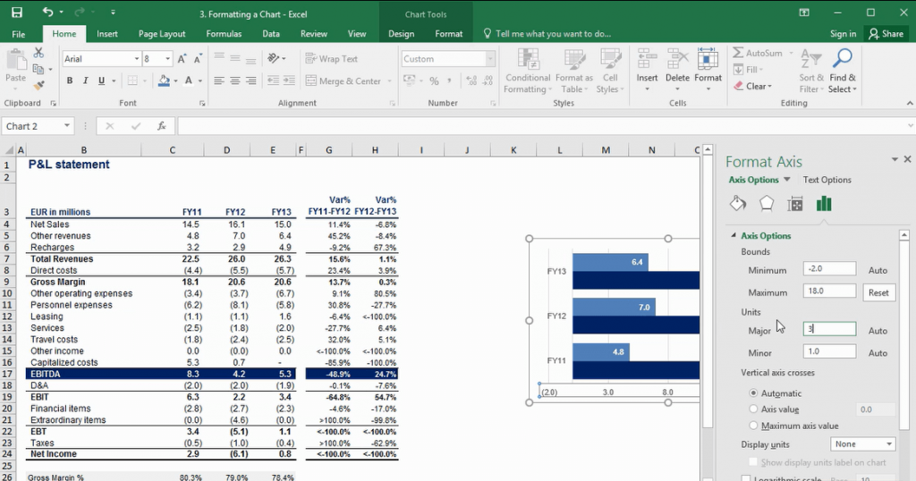
Let’s format the axis a little bit, shall we?
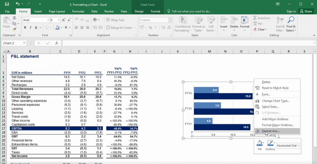
I’ll adjust the minimum and maximum dimensions, so that our chart shows the data in a better way.
And here is our modified chart. Pretty neat, right?